In order to make a radially symmetrical design, they created a design on triangles of tracing paper. With this tracing paper, they transferred their designs onto their drawing paper until it created a design that radiated from a center axis. Once drawn, they were able to color inside their unique designs by utilizing their newly learned skill of value and color blending. They also learned that outlining their shapes in black and coloring dark, rich, and waxy can make all the difference in their final drawing. It is amazing how different everyone's mandala drawings can be, even though they were all given the same instructions and criteria. The themes the students chose ranged from floral, geometric, fish, hunting, food, and many more! The diverse themes just go to prove I have quite the group of creative thinkers.
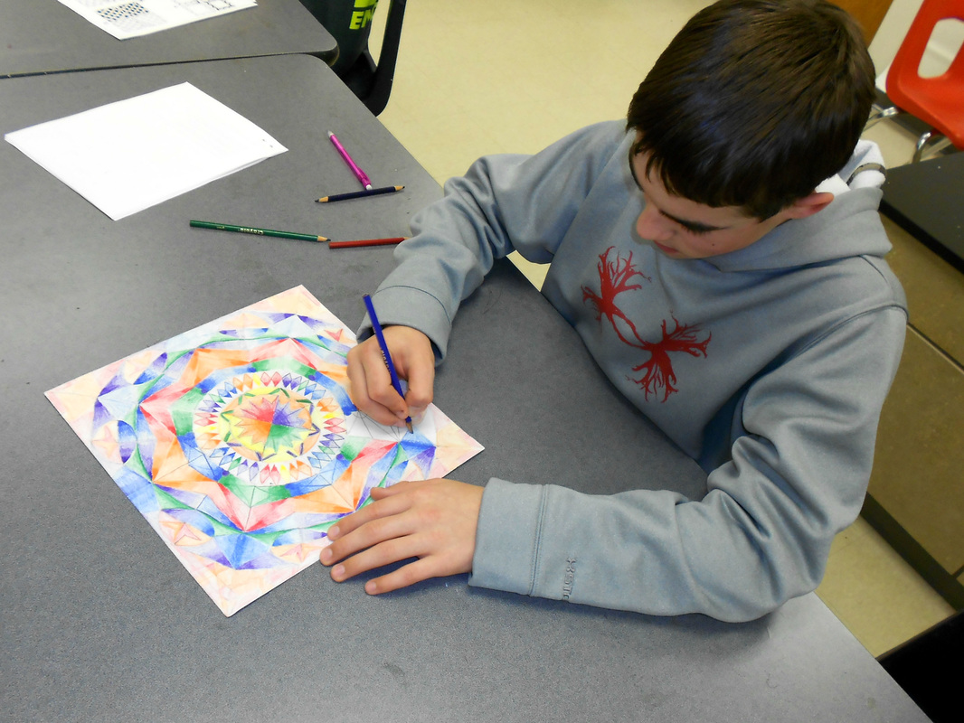
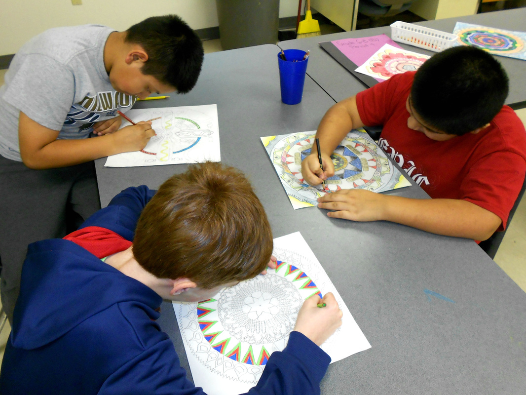
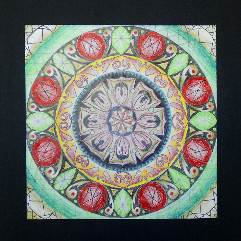
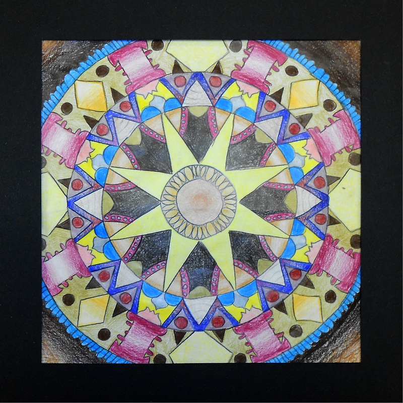
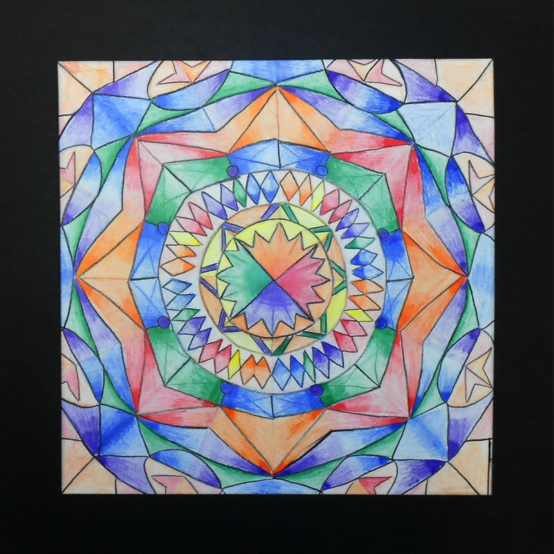
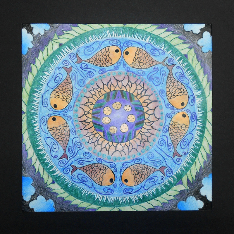
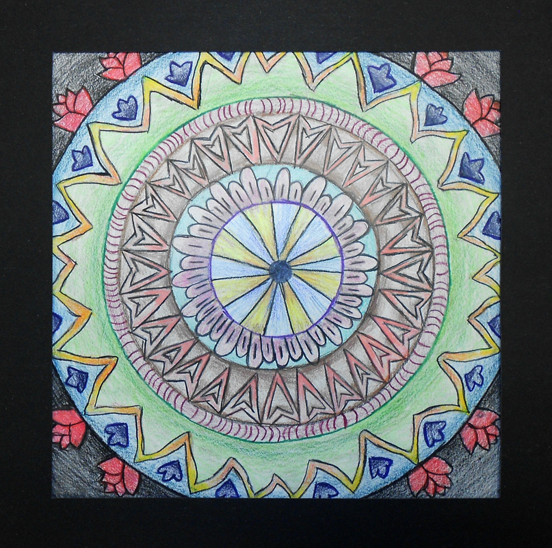
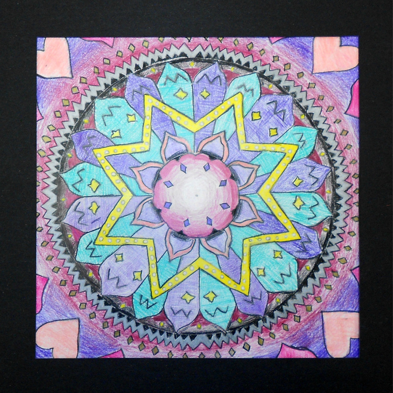
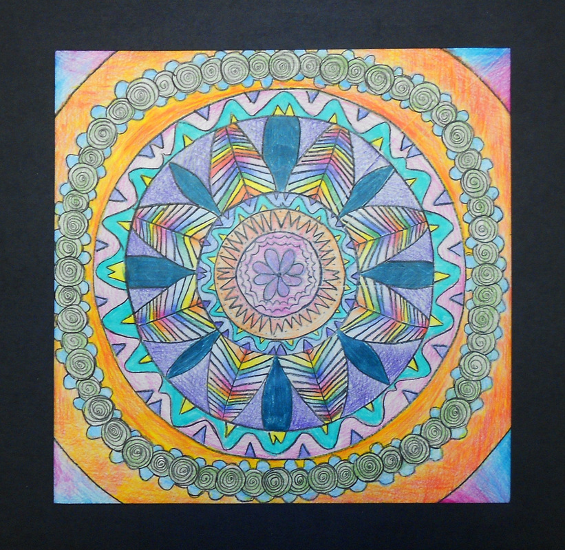
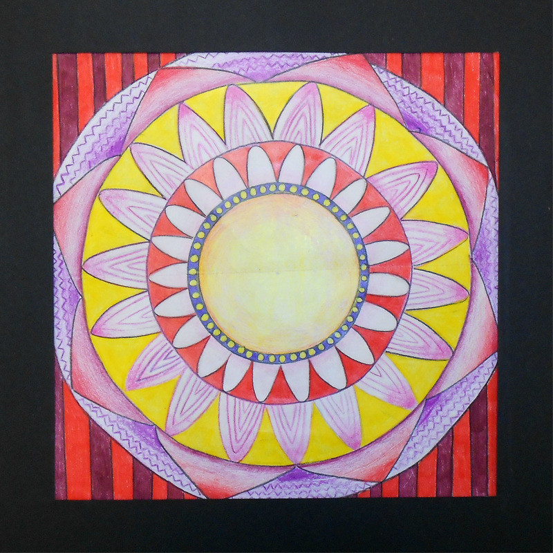
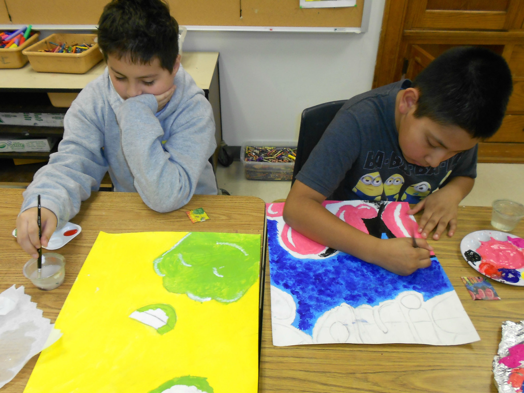
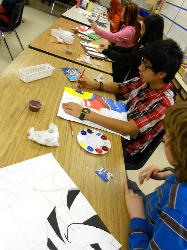
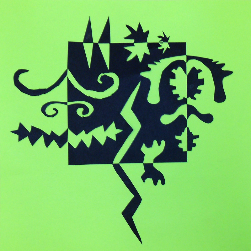
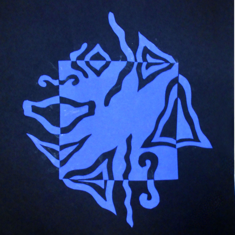
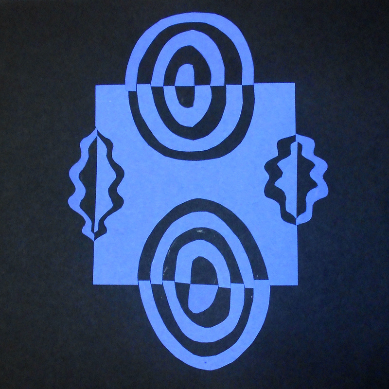
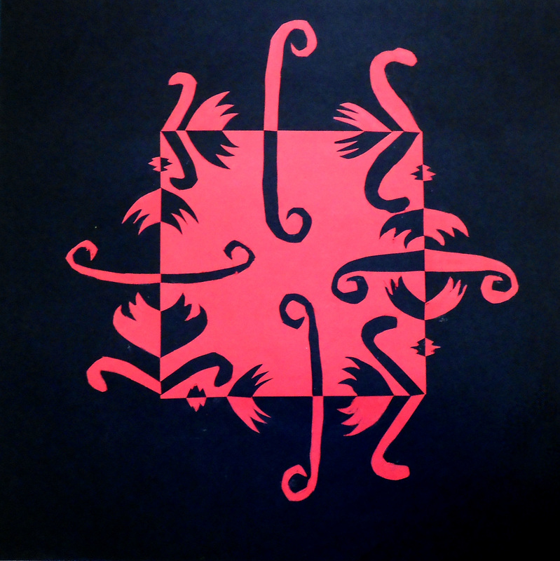
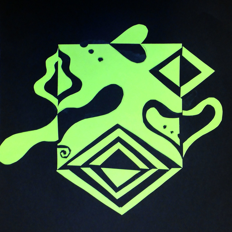
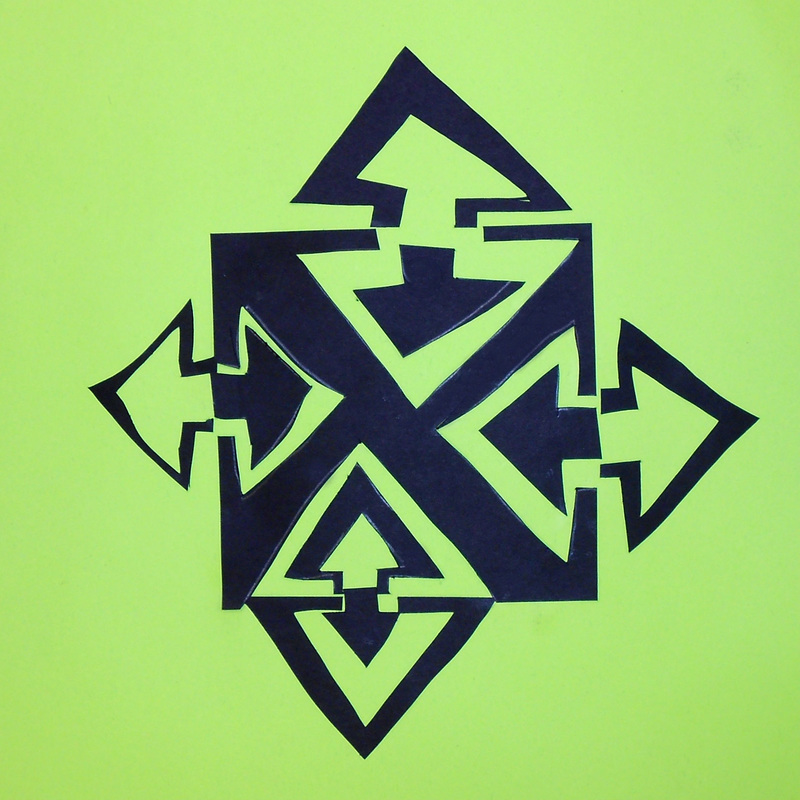
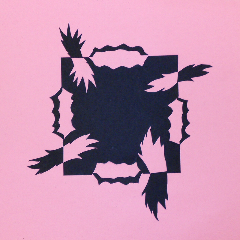
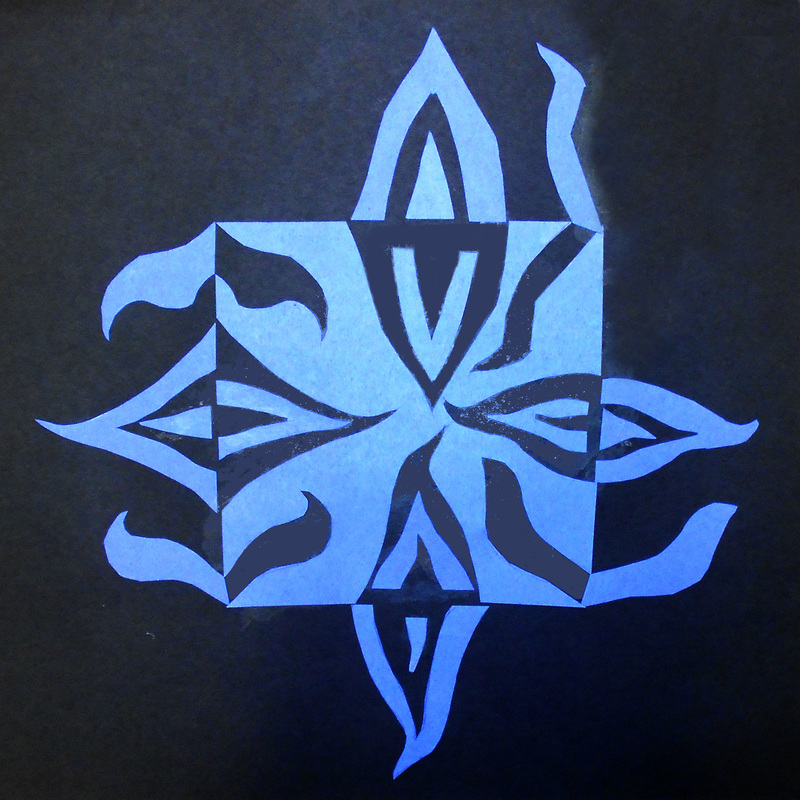
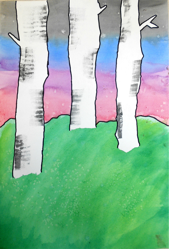
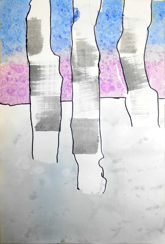
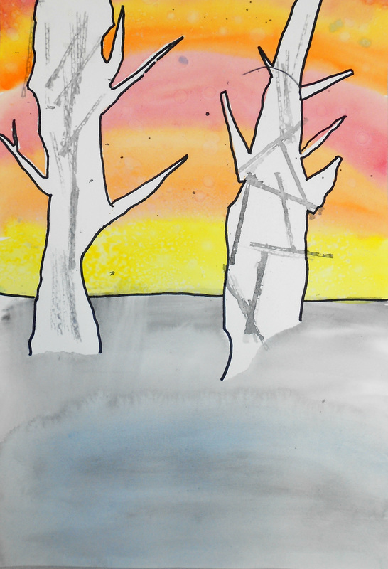
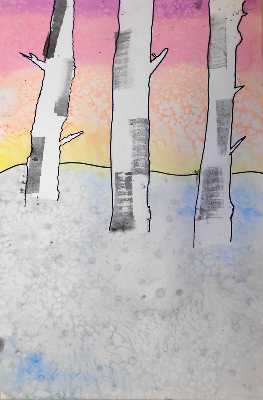
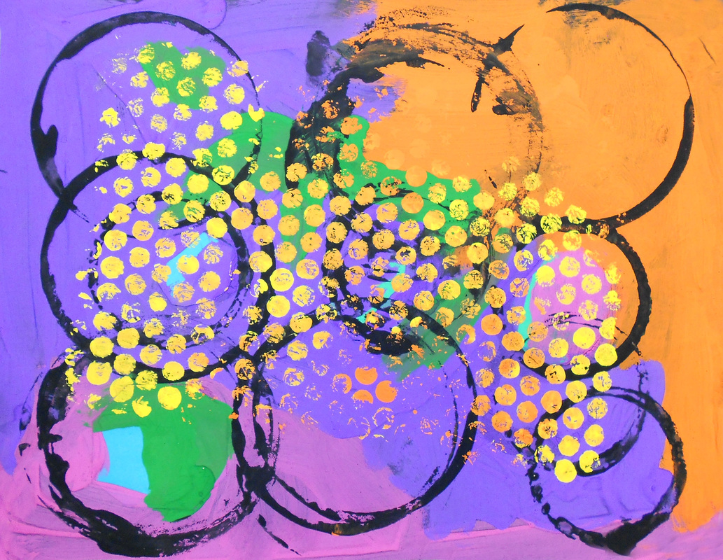
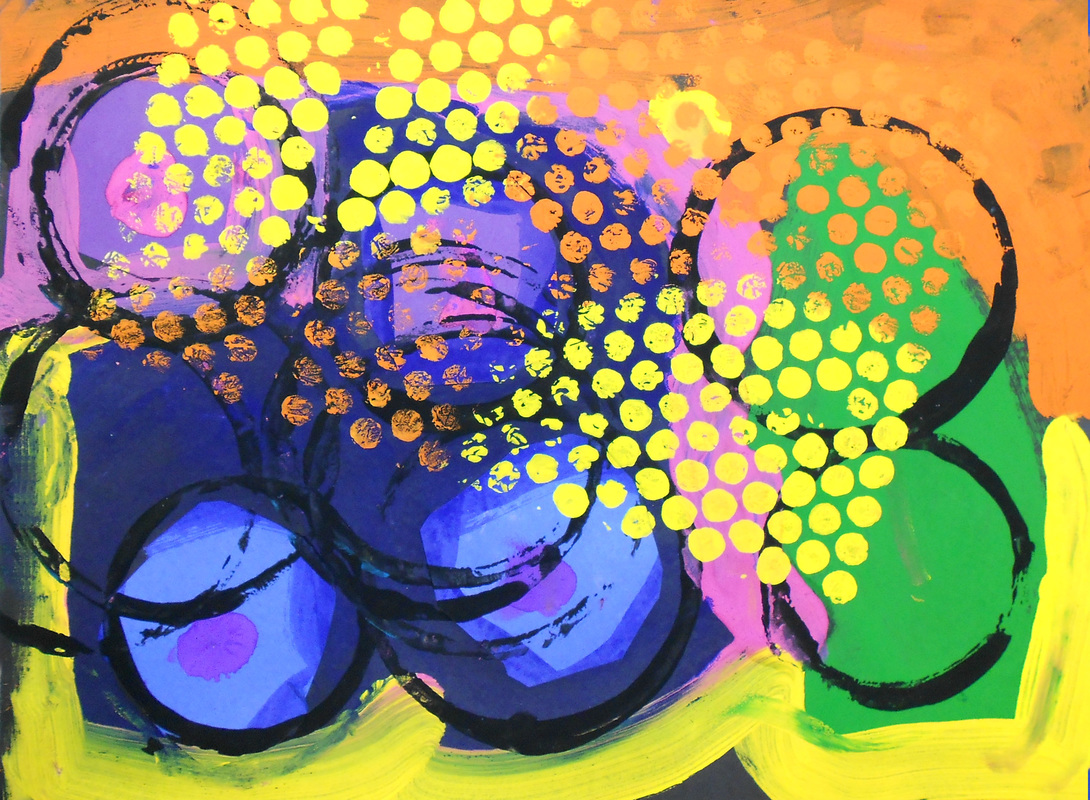
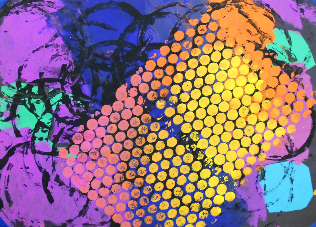
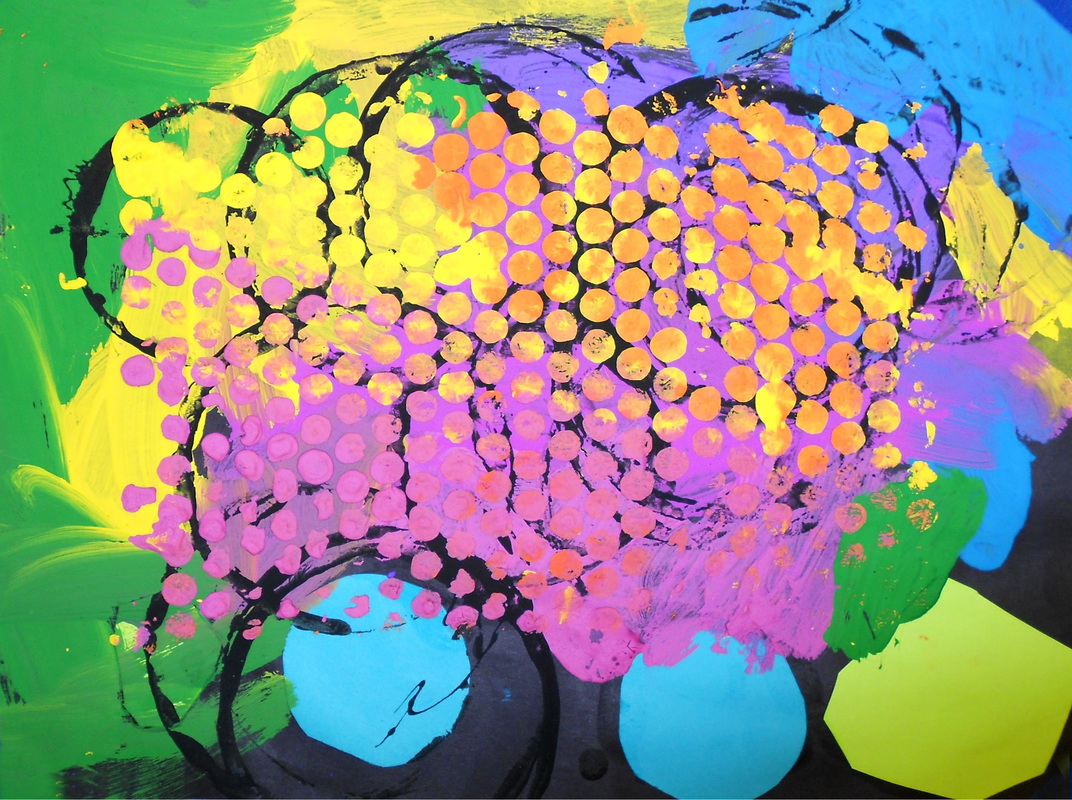
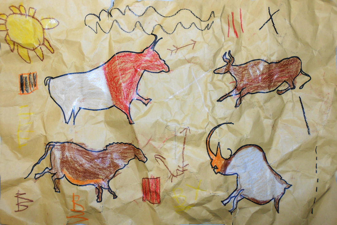
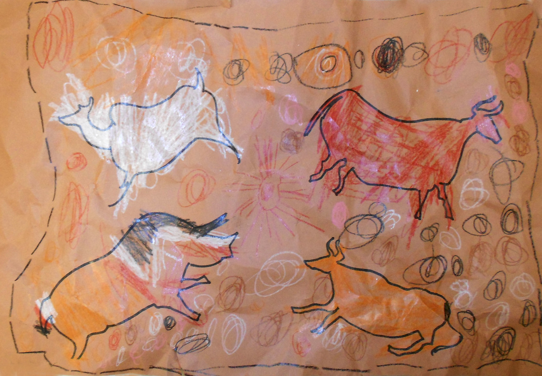
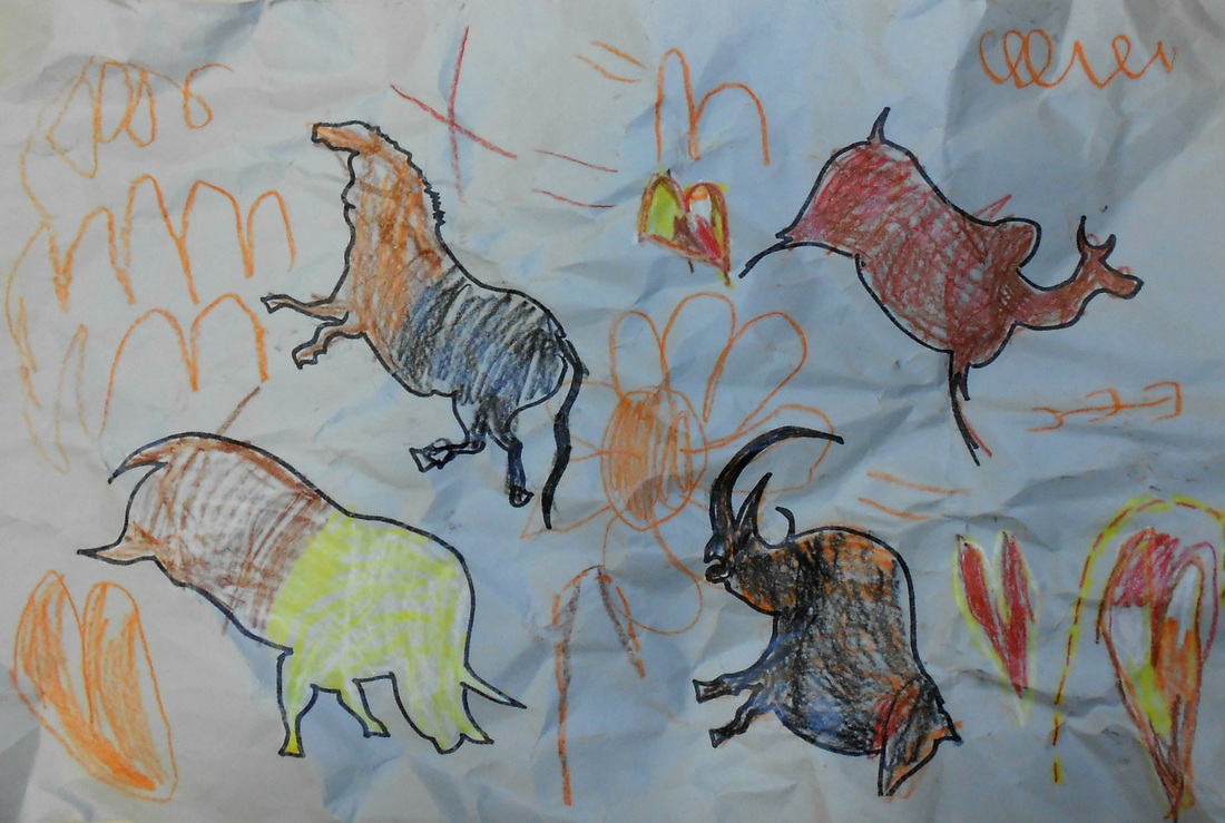
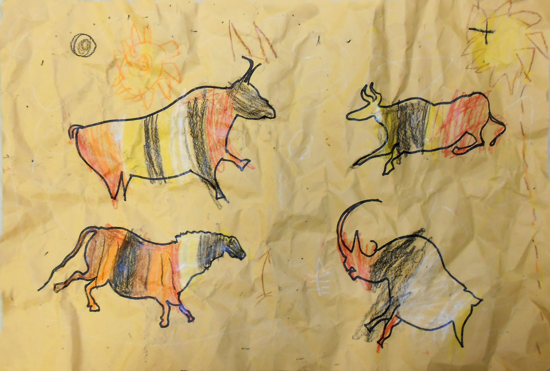
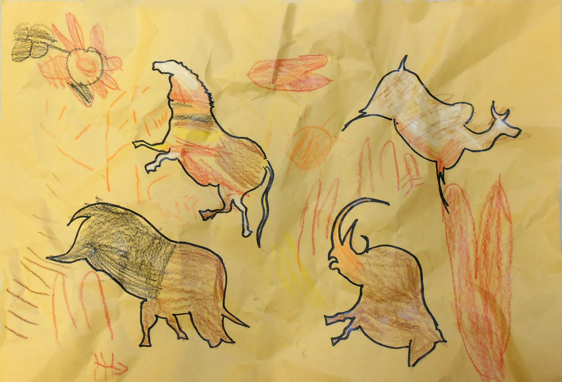
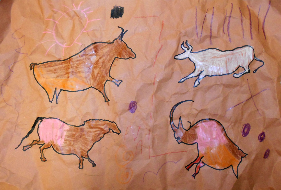
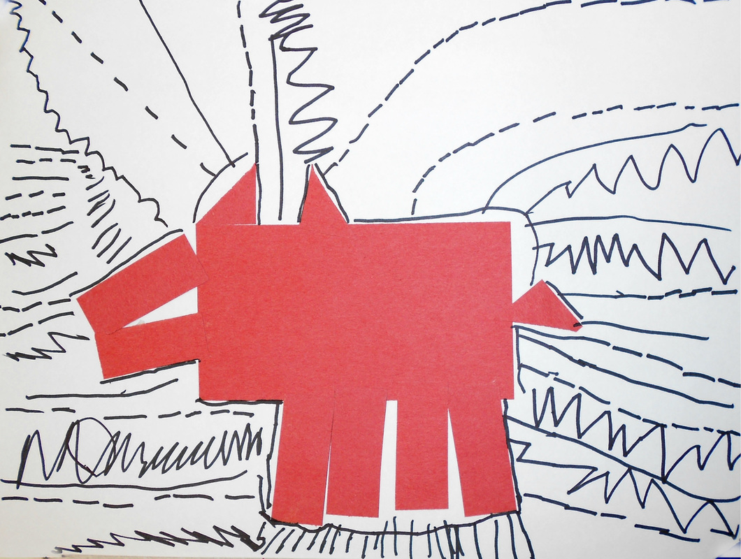
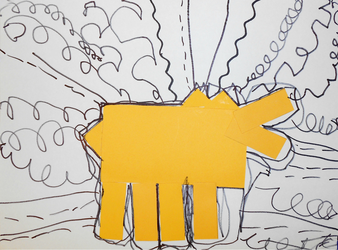
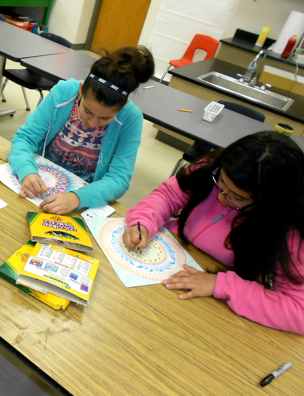
With their recent unit on value, the middle schoolers learned how making mandalas can be a meditative process. Tibetan monks spend days to weeks creating mandalas out of sand only to wipe them away when they are done. These students also spent weeks creating mandalas that they can be proud of, but, unlike the monks, they get to take theirs home when they're done. They learned that value is the lightness or darkness of a picture and that they can value blend by pressing harder or softer with their colored pencils to create a range of values. Another coloring technique they utilized was color blending, in which they blended one color into another one to create an all new color or a gradient. Aside from value, the middle schoolers explored the principle of design known as balance. They briefly touched upon the different kinds of symmetry and what makes radial symmetry unique. In order to make a radially symmetrical design, they created a design on triangles of tracing paper. With this tracing paper, they transferred their designs onto their drawing paper until it created a design that radiated from a center axis. Once drawn, they were able to color inside their unique designs by utilizing their newly learned skill of value and color blending. They also learned that outlining their shapes in black and coloring dark, rich, and waxy can make all the difference in their final drawing. It is amazing how different everyone's mandala drawings can be, even though they were all given the same instructions and criteria. The themes the students chose ranged from floral, geometric, fish, hunting, food, and many more! The diverse themes just go to prove I have quite the group of creative thinkers.
0 Comments
The entire school celebrated National Language Week in a variety of ways, from reading the announcements in a different language each day to designing posters for the Big Foot Area School District poster contest. We had a total of 11 participants in this contest, all of whom worked very hard by putting their current projects on hold and even taking their posters home with them. Of all our participants, Anna Mac Leod was awarded 2nd place and Abby Vandebogert and Lindsay Paulsen both tied for 1st. These 1st place winners went on to be judged at Big Foot High School against the other schools in the consortium and both won. Their posters can now be viewed at the Big Foot Area High School! The rest of the staff and I would like to extend a big thank you to all who participated and a congratulations to the three young artists who won awards!
The middle schoolers started learning about the element of color in this Pop Art inspired art project. They saw examples of famous Pop Artists as well as learned the impact that visual culture has on their lives. They came to see that they are constantly bombarded by logos and products. Pop art easily blurs the line between advertising and what we consider art. They even got to see a clip of Wayne's World and how Mike Meyers spoofed this phenomenon. The middle schoolers started off slow by reviewing the basics of color mixing, using acrylic paints. They used the primary colors to mix the secondary and tertiary colors. After that, they saw how they could add white, gray, or black to any of the colors on the color wheel to create tints, tones, and shades. Even though some students were already pros at color mixing, going back to the basics is still important before jumping into a project that revolves around color mixing. Once the middle schoolers prepared a food or candy wrapper reference of their choosing, they got started on making a grid drawing of that reference. This allowed them to see the grid lines of their small references and proportionately convert the images they saw onto the larger grid of their paper. Once drawn, they were ready to put their knowledge of color mixing, as well as five different painting techniques, to use in their picture. Demonstrating these painting techniques may have been the most challenging part of the project but I thoroughly enjoyed seeing how my middle schoolers tackled these challenges. It is not only obvious that they have finished this project with knew found knowledge of painting but they all have wonderful paintings to show for it! Some middle schoolers have finished their candy wrapper paintings early. To accommodate for the fast workers, I've given them an extra assignment of creating a Japanese Notan Design project. This project plays off of manipulating positive and negative space. The middle schoolers began with a colored paper square, onto which they drew shapes coming off of each of the edges. They then cut these shapes out with either a scissors or an x-acto blade. These shapes are flipped over, creating negative space within the paper square and extending the positive space into the background of the paper. Although this is not an assignment that everyone has had an opportunity to participate in, I believe they turned out looking too beautiful not to share.
The 5th graders moved onto their texture unit by looking at the art of Claude Monet. They learned what it means to have texture and saw how Monet's paintings used thick brush strokes to create a variety of textures. Some areas of his paintings showed small quick brush strokes while others areas had smoother longer brush strokes. Since Monet was an Impressionist painting, color and light was very important in his art. They discussed the differences in light and color in a series of four paintings of Birch trees. They also discussed what the differences of light and color told us about the time of day and the time of year that the painting was made. With this watercolor painting project, the students had to decide what time of the day or year they wanted their birch trees to be in.
Before even beginning their tree painting, the students experimented with creating 10 different watercolor techniques to create implied texture. These techniques include wet-on-wet, dry brushing, variegated wash, graded wash, Scraffito, salt, rubbing alcohol, saran wrap, lift off, and splatter paint. This may have been difficult for the students at first but it was good practice for their final painting. Although I do not expect each student to remember or master all 10 techniques, my goal was to have students become comfortable with a select few watercolor techniques that they will be using in their final painting. The students began their Birch tree picture by tearing the edges of masking tape to create a ragged edge on either side of the tape. This torn piece of tape was laid onto their paper where they wanted their trees to be. It was important for the trees to start higher up on the paper and go past the top of the paper to make it look like the trees were taller than our view. If they wanted, the 5th graders placed the left over thin pieces of tape onto their tree trunks to create branches. When they were ready to move onto watercolors, they were sure to paint the ground first to make sure that the horizon line went above the trees. This is when they chose a watercolor technique to represent the ground, whether they were making flakey snow or bristly grass. On another day, once the ground has dried, the 5th graders moved onto the sky. Many students chose the variegated wash in the sky by blending one color into another. Some students took this one step further and included an additional watercolor technique along with the variegated wash. With the ground and the sky painted, the painting was ready to have the tape removed. After having the tape removed, it was apparent that the watercolor did not stick to the areas were the tape had been, leaving white for the Birch trees. The students used Sharpie to outline the horizon line and the trees to help them pop out from the page. For a final touch, the students took squares of cardboard, painted black watercolor paint on the corrugated part of the cardboard, and scraped it across areas of the tree to make them look a bit more like Birch trees. This was a challenging project for the 5th graders. They really had to push themselves in working with such complicated painting techniques but we had many beautiful paintings when everything was done. The students definitely impressed me as well as themselves with how these Monet inspired Birch tree paintings turned out. For the Kindergarten shape unit, the Kindergarteners were read the book "The Dot" by Peter H. Reynolds. After reading this book, they learned how to identify shapes and learned how shapes result from lines that close. They also saw the many different ways the main character in the book created dots. In that aspect, the Kindergarteners were also going to incorporate many different ways to create dots in their own paintings.
They began by cutting circles out of construction paper and gluing them down to black paper. Once glued, they went to the painting station and chose 4 colors to paint in the background however they wanted. During the next art class, after the paint had dried, they used empty yogurt cups as stamps to create circles on top of their painted background. They each took a small and a large yogurt cup, placed it in a plate with black paint, and stamped the black paint on the rim onto their paintings. This resulted in black circles of varying sizes. Once completed, the Kindergarteners went to the bubble wrap station. Here, I supervised the Kindergarteners painting on top of bubble wrap, placing their paper on top of the bubble wrap, pressing on the back, and lifting their paper to reveal many tiny dots that were printed onto their paper. This is the final step of their project. This is an example of an art project that yields such diverse results, even though all the students worked on each specific step together. The Kindergarteners learned about texture in this unit. Before touching the clay, they removed their shoes and noticed the different patterns on the bottoms of them. If they ran their hands over the patterns, they noticed their shoes had a bumpy texture to them. I told them that they would be using the texture of their shoes as stamps for this project. I also allowed the students to pass around clay and had them describe what the texture of the clay felt like to them. This allowed them to practice describing textures as well as become familiar with clay before actually working with it.
When the Kindergarteners were ready to start, they all began by taking a small circular stamp and pressing it into squares of clay. They kept the circle that resulted from the stamp and set aside the extra scraps of clay. With this circle, they used their shoes to press their shoes into the clay. Many of the students were afraid to press hard in fear of squishing the clay too much. Once stamped, I used a straw to punch a hole into the clay for the string to go through. I was able to fire the necklaces before the next art class. During the next art class, I taught the students how to glaze their necklaces. Unlike painting, glaze quickly dries and has a different color than what it will end up looking like when it is fired. They each painted two coats, leaving no white spaces except for the bottoms of the necklaces. After they were fired, I threaded yarn through the holes so that the Kindergarteners could have completed clay necklaces. The Junior Kindergarteners moved on from shape to texture in this Lascaux Cave drawing project. They began by taking a virtual tour through the caves, identifying drawings of animals on the walls as the camera moved through the cave. Already being familiar with texture, the students discussed the textures they saw in the cave walls and how that might affect what it would be like to draw on the walls. The Junior Kindergarteners also discussed why cavemen might draw the images they chose to draw. Since animals were so important for human survival, they often drew images of animals in cave drawings.
The Junior Kindergarteners received papers with a variety of different colors to make them look comparable to the walls of caves. On these papers were outlines of cave animals that were often found in cave drawings. They were given natural colored crayons, such as black, brown, white, and red, and were encouraged to color inside the lines of the animals. The students were also encouraged to draw lines, shapes, and any other symbols they felt were appropriate in the background to make their drawings look that much more like what they saw in the Lascaux Caves. Everyone's favorite step in this project was at the end when the whole class crumpled their papers into small balls. They did this three times to give their drawings a rough, rock-like texture. The Junior Kindergarteners had lots of practice putting smaller shapes together to make a larger picture in their Keith Haring dog pictures. They took this knowledge one step further in this owl Mosaic project. The students saw an example of an ancient Roman Mosaic of an owl and how it was made up of small glass square shapes. Rather than using glass, they would be using small paper squares instead.
Starting with a black piece of paper with an outline of an owl, the Junior Kindergarteners took pre-cut squares of brown paper and glued them down into the spaces of the owl. Once the feathers of the owl were done, they glued down small gray squares for the branches. Once the squares were glued down, they moved onto other shapes to give the owl additional details. They glued orange triangles and rectangles down for the beak and talons as well as gluing down white circles for eyes. Each Junior Kindergarteners was given a black marker to draw pupils inside the eyes. After learning about different kinds of lines, the Junior Kindergarteners moved onto an art project that incorporated more lines as well as shapes. They learned about the artist Keith Haring and they identified shapes in his artwork. They could easily see how they could use pre-cut out shapes and arrange them to look like a dog, much like Keith Haring did in his art. As a class, we all took our large rectangles and glued them down to the paper for the body of the dog. Then, the Junior Kindergarteners glued down their smaller rectangles for the snout of the dog and then the legs. Last, they used small rectangles to form the ears and the tail. Keith Haring liked to include lines in his art so I thought it was only fair to have the students practice drawing straight, dashed, loopy, zigzag, and curvy lines. They did not have to use all of these lines in their Keith Haring dog pictures but they demonstrated how to do about 3 of them. Overall, we ended up with many cute, unique Keith Haring dog pictures!
|
Student ArtworkWelcome to the Sharon Community School art page! Here, you can see what your child is doing in the art class room. Hovering over the image will reveal the young artist's name. You can enlarge the picture of your child's art by clicking on the image. Categories
All
|